Monday, September 30, 2019
Wednesday, September 25, 2019
Week 5 Blog Post Project 3
An icon design is a graphical symbol that represents fictional, nonfictional or abstract motive, or action. In software applications, an icon represents a program. Similar to the YouTube play button icon on your phone.
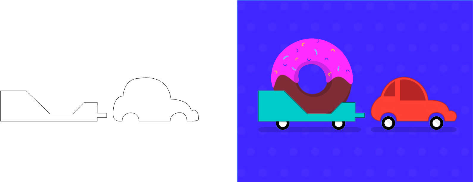
Icon styles need have clarity and simplicity. Less detail and also using firm shapes. Firm shapes makes the icon set firm and also attractive.
The clarity and simplicity icons resonated with me. You don't have to be detailed to be good. A well design is simple and is clarified.
These are the simplest icons. But you can still describe the icon by looking at it.


Sunday, September 22, 2019
Week 4 blog - project 2
"We're on FIRE!" - Bill Nye The Science Guy
Yes indeed we're in fire. As we speak were peaking record high in Carbon Dioxide in our atmosphere. My design is a Microwave heating the Earth. The first thing you see is the Earth. I wanted to emphasize Earth, because it should be a priority rather than global greed.
Wednesday, September 11, 2019
Wk 3 blog post
The challenge was the pen practice tutorial. It was difficult at first to use it. Using the handle was the hardest. I went online and researched easy keys such as the Control key that edits the pen.
It was hard enough without a mouse but I managed it. But I adapted and overcome my weaknesses.
Friday, September 6, 2019
Blog post Week 02
Vector art is created using illustration software. Vector art is mathematical equations to create art cleanly, precisely and optimally. The computer remembers mathematical formulas for the lines and shapes you put and redraws them at any scale. Sorta like normal 3D graphics works.

https://www.pinterest.com/artfoundations/op-art-~-optical-illusions/
This is a good example of repetition.
This is a basic 2D image and it's an illusion. It's interesting that basic repetition can mesmerize the most powerful tool in the universe.

https://www.thoughtco.com/definition-of-balance-in-art-182423
This is an example of a balanced art.
It's equalizing the composition of the art. Half of the art being similar to the other half of the art.
https://sites.google.com/a/ccsd.edu/mrs-lalli-klimasz-s-site/grade-7-art/art-research
This is a good example of emphasis being projected in art. There are 2 elements. A circle and a square. There are 15 circles but only one square emphasizing the giant square surrounded by dozens of small circles. When seeing this the first thing you see in the one giant square.
Sorry for the blog being late. I was late to class because I missed the shuttle; I wasn't there for the full instructions.
Subscribe to:
Posts (Atom)